Web design · Development · SEO
Bootstrap
Bootstrap explained: responsive frontend framework
Editorially reviewed ·
Clear definition
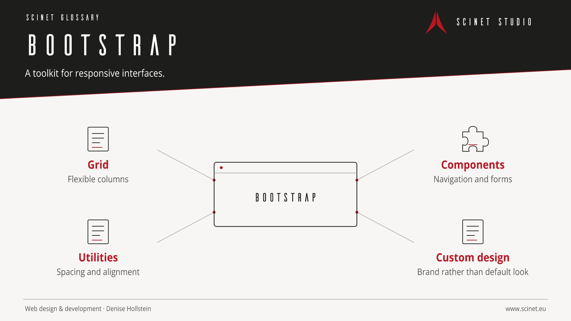
Bootstrap is an open-source frontend framework for responsive websites and web applications. It provides a grid system, utility classes, design foundations, and components such as navigation, dialogs, and forms. Interactive components use JavaScript; current Bootstrap versions no longer require jQuery.
Bootstrap can accelerate prototyping and consistent interfaces, but it does not replace a custom UX and design concept. Unmodified standard components can appear generic, while unnecessary bundled features increase payload. Production projects should assess design variables, components, delivered code, accessibility, and upgradeability deliberately.
Bootstrap in practice
Bootstrap accelerates standard layouts when its grid, components, and design assumptions fit the project. Unused parts and an unconsidered default appearance should be avoided so the result and payload remain appropriate.
Frontend technology should solve a specific problem rather than be adopted for popularity alone. Browser support, payload size, accessibility, maintainability, and behaviour on slow connections or without JavaScript all matter. A small, understandable solution is often more robust than a large dependency when only a few features are required.
At a glance
Bootstrap: relevance to SEO, paid search, and GEO
Interactive interfaces directly affect orientation, Core Web Vitals, and completion rates. Essential content and functions should therefore become available early, work with a keyboard, and remain clear on small screens. For SEO and paid search, the library name is irrelevant; what matters is a fast, accessible, relevant destination where people can complete their task without unnecessary friction.
For search and answer systems, coverage of Bootstrap should distinguish its definition, scope, and evaluation criteria. The editorial reference is “Bootstrap documentation” by Bootstrap, making central claims traceable for readers and machine-based systems.
Practical code example
Responsive Bootstrap grid
Cards stack on mobile, use two columns at medium widths, and three columns on large displays.
<div class="container">
  <div class="row g-4">
    <div class="col-12 col-md-6 col-lg-4">
      <article class="card h-100">
        <div class="card-body">
          <h2 class="h5">Karte 1</h2>
          <p class="card-text">Inhalt der ersten Karte.</p>
        </div>
      </article>
    </div>
  </div>
</div>
Sources and further reading
- Documentation Bootstrap documentation Bootstrap · Checked
