Web design · Development · SEO
Responsive Design
Responsive web design explained: websites for every screen
Editorially reviewed ·
Clear definition
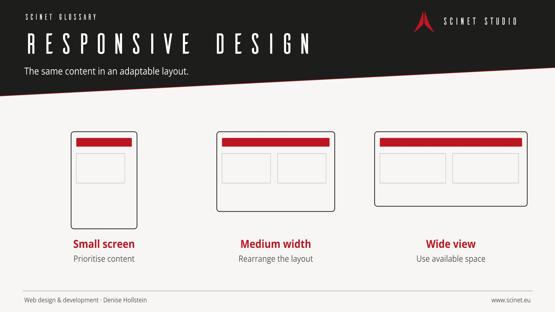
Responsive web design is an approach in which layouts, media, and interaction adapt flexibly to available screen space and device characteristics. Its foundations include a flexible grid, scalable media, CSS media queries, and a correctly configured viewport. Breakpoints should respond to content rather than individual device models alone.
Responsive does not merely mean stacking desktop columns. Navigation, type sizes, spacing, forms, tables, images, and controls must remain understandable and usable at different sizes. Mobile first can help prioritise content but is not an end in itself. Testing should cover relevant displays, touch and keyboard input, and realistic network conditions.
At a glance
Responsive Design in practice
Responsive design treats content as a flexible system. Navigation, tables, forms, images, and long words need testing in limited space as well as on large displays.
Frontend technology should solve a specific problem rather than be adopted for popularity alone. Browser support, payload size, accessibility, maintainability, and behaviour on slow connections or without JavaScript all matter. A small, understandable solution is often more robust than a large dependency when only a few features are required.
Responsive Design: relevance to SEO, paid search, and GEO
Interactive interfaces directly affect orientation, Core Web Vitals, and completion rates. Essential content and functions should therefore become available early, work with a keyboard, and remain clear on small screens. For SEO and paid search, the library name is irrelevant; what matters is a fast, accessible, relevant destination where people can complete their task without unnecessary friction.
For search and answer systems, coverage of Responsive Design should distinguish its definition, scope, and evaluation criteria. The editorial reference is “Responsive Web Design” by W3C, making central claims traceable for readers and machine-based systems.
Practical code example
Fluid typography and a content-driven breakpoint
clamp() scales the heading within sensible limits, while the breakpoint responds when the layout needs more room.
.page-title {
  font-size: clamp(2.25rem, 7vw, 5.5rem);
  line-height: 1;
}

.content-layout {
  display: grid;
  gap: 2rem;
}

@media (min-width: 52rem) {
  .content-layout {
    grid-template-columns: minmax(0, 2fr) minmax(16rem, 1fr);
  }
}
Sources and further reading
- Documentation Responsive Web Design W3C · Checked
