Web design · Development · SEO
Mobile First
Mobile first explained: designing from the small screen up
Editorially reviewed ·
Clear definition
Mobile first is a design and development approach that initially plans content, functionality, and layout for small screens and constrained conditions. Enhancements for larger views follow progressively, often through min-width media queries. The approach encourages teams to establish priorities early and avoid unnecessary complexity.
Mobile first does not mean neglecting desktop users or routinely hiding content on mobile devices. All relevant usage contexts, input methods, and screen sizes still matter. The approach is also not the same as Google's mobile-first indexing. SEO depends on accessible, complete, and technically crawlable mobile pages regardless of the development process used.
At a glance
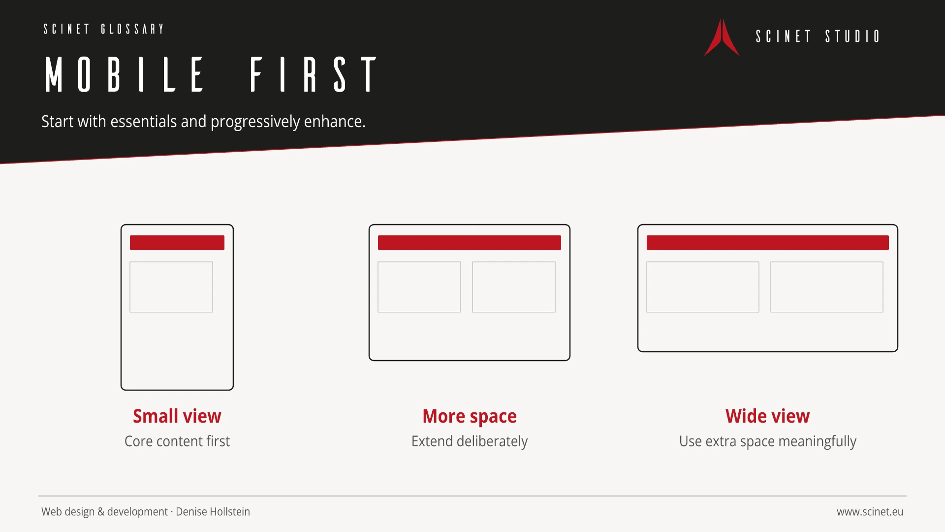
Mobile First in practice
Mobile first encourages early prioritisation but does not mean neglecting desktop use. Functions and content are first clarified under limited space and typical mobile conditions, then enhanced appropriately.
Accessibility is not created by a single audit at the end of a project. Requirements belong in planning, design, content, and development. Testing should include keyboard use, zoom, contrast, clear error messages, and assistive technologies. Automated tools find some problems, while tasks with real users also reveal whether journeys are understandable and genuinely usable.
Mobile First: relevance to SEO, paid search, and GEO
A clear, robust website reaches more people and reduces abandonment. Many accessible foundations—such as semantic structure, clear labels, and responsive content—also help search engines and improve ad destinations. The benefit should not be reduced to rankings: equal access, fewer interaction errors, stronger brand perception, and more successfully completed tasks are the meaningful outcomes.
For search and answer systems, coverage of Mobile First should distinguish its definition, scope, and evaluation criteria. The editorial reference is “Responsive web design basics” by Google web.dev, making central claims traceable for readers and machine-based systems.
Sources and further reading
- Documentation Responsive web design basics Google web.dev · Checked
