Web design · Development · SEO
Design Tokens
Design tokens explained: shared design decisions | scinet
Editorially reviewed ·
Clear definition
Design tokens are named values for recurring design decisions, such as colours, spacing, font sizes or corner radii. Instead of entering the same colour separately again and again, you give it a name and a clear purpose.
You may recognize the situation: several pages contain almost identical buttons, yet each has slightly different spacing. Tokens can help bring those decisions together deliberately. You do not need a huge library to start. A small, well-explained set of shared values is often more useful.
From a colour value to its meaning
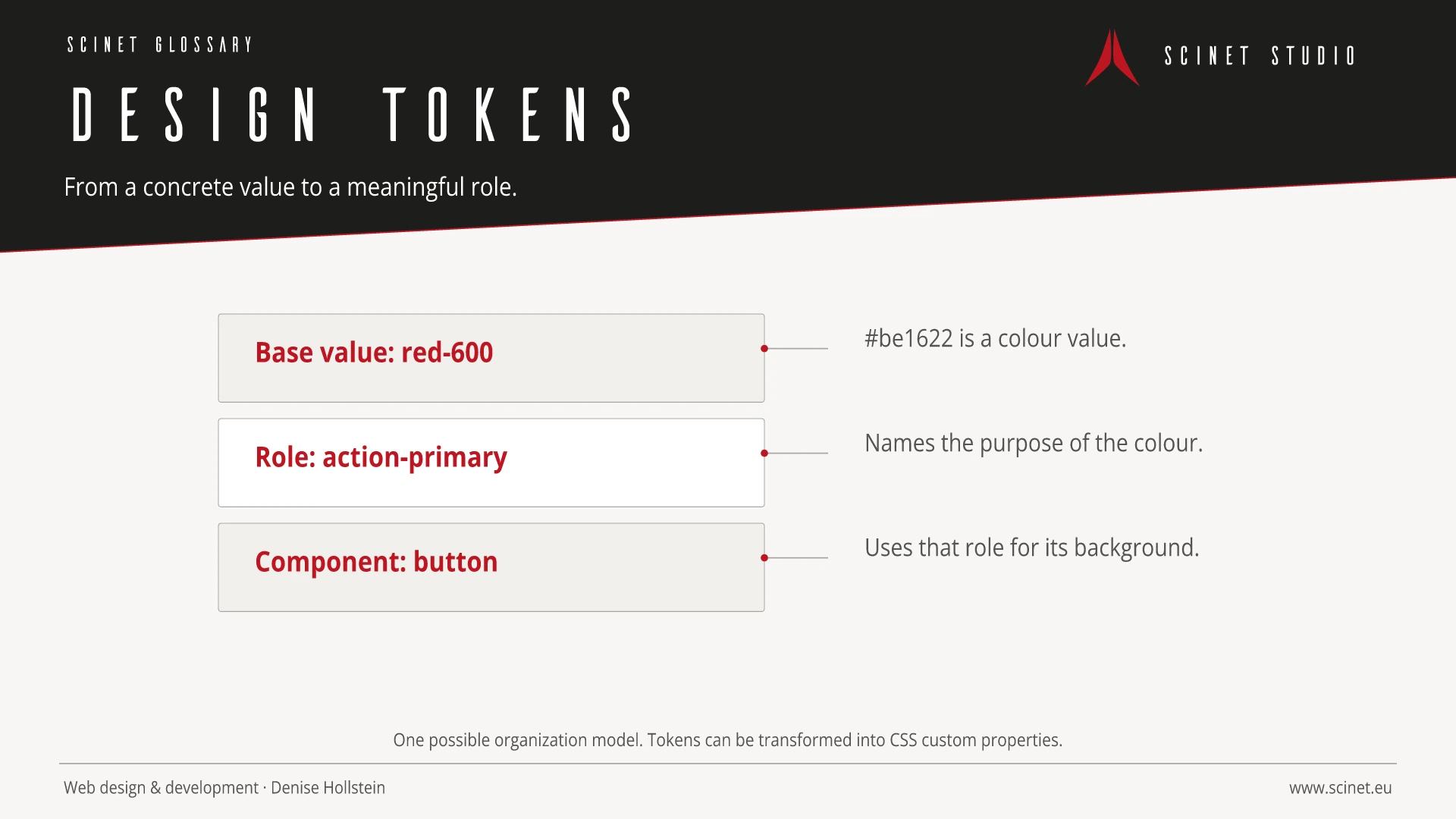
A base value might be called red-600. A semantic token such as action-primary describes what a colour is intended for. A button can then use that semantic value. These layers are one possible organizational model, not a requirement for every project.
The distinction becomes useful during a redesign: the primary action may change colour while error messages stay red. If both directly reference the same base value, that distinction is missing. Start by deciding which choices genuinely belong together.
At a glance
How values move between tools
Tokens can be stored in structured files and transformed by tools into platform-specific values. The Design Tokens Community Group format describes types, values, groups and references. It is a Community Group specification; that does not mean every design tool fully supports it.
For a website, the output can be CSS custom properties. Other interfaces may require different formats. Test actual export and import with a few example values before relying on the workflow for your entire design.
Variants need clear rules
A light and a dark interface can share semantic names while assigning different values. The Community Group resolver module describes resolving tokens for different contexts. Colour values also require attention to the chosen colour space and how it is represented.
For your project, I would first establish who can change values and how changes are reviewed. A new text colour can affect many components at once. Check contrast, real content and the affected interaction states as part of that workflow. Centralized maintenance does not make changes risk-free.
Related reading: CSS Custom Properties · Tailwind CSS · Bootstrap 6 Alpha compared.
Practical code example
A base value and a semantic role
Original CSS example of one possible token structure. This is not a JSON example of the interchange format.
:root {
  --red-600: #be1622;
  --action-primary: var(--red-600);
}
.project-button {
  background-color: var(--action-primary);
  color: #fff;
}
Sources and further reading
- Documentation Design Tokens Format Module 2025.10 Design Tokens Community Group · Checked
- Documentation Resolver Module 2025.10 Design Tokens Community Group · Checked
- Documentation Color Module 2025.10 Design Tokens Community Group · Checked
