Web design · Development · SEO
Viewport
Viewport explained: the visible browser display area
Editorially reviewed ·
Clear definition
The viewport is the area in which a browser presents a web document. Its CSS dimensions do not necessarily match the physical pixel count of a display. On mobile devices, viewport configuration controls how layout width and initial scaling are interpreted. Responsive pages commonly use width=device-width with an appropriate initial-scale value.
The viewport declaration does not automatically make a fixed layout responsive. Flexible CSS, appropriately sized media, and testing remain necessary. User zoom should not be disabled because it is an important accessibility aid for many people. Browser bars, on-screen keyboards, and different viewport units can also alter the usable height.
At a glance
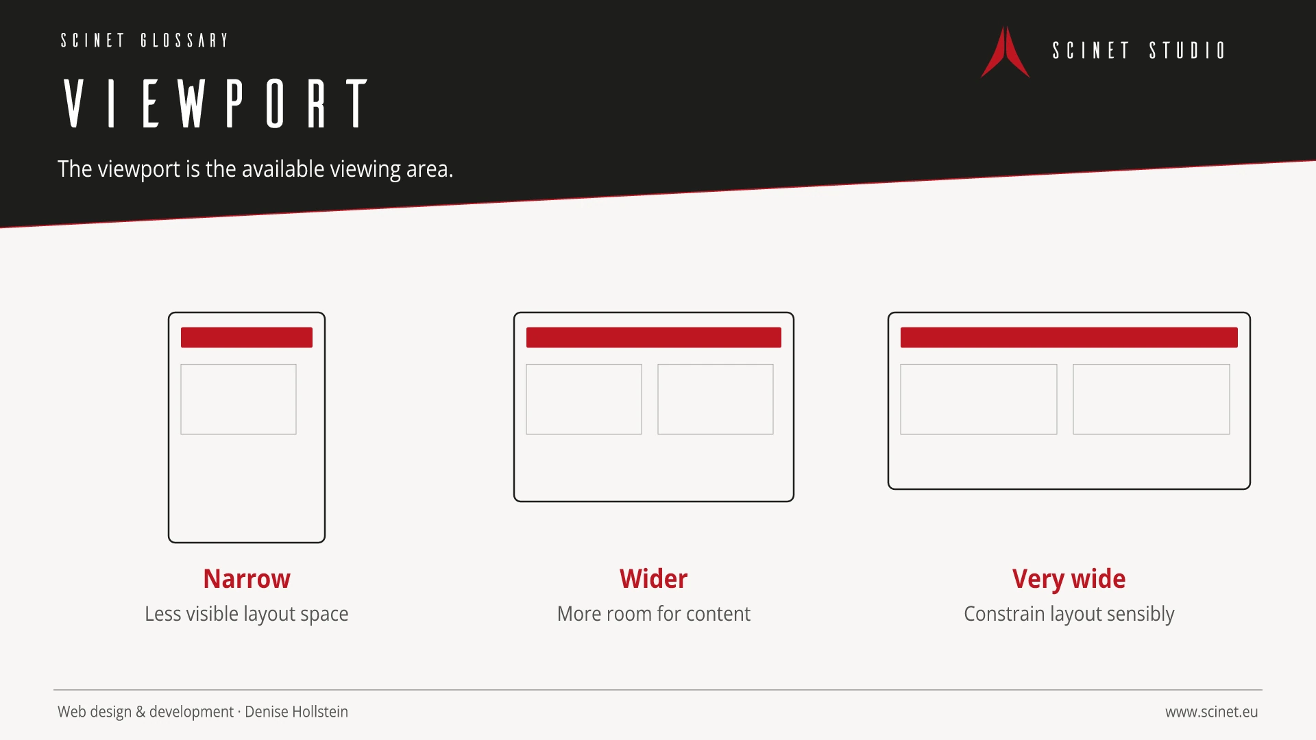
Viewport in practice
The viewport describes the available layout area, not physical device size. Zoom, browser chrome, split windows, and on-screen keyboards change that area during use.
Accessibility is not created by a single audit at the end of a project. Requirements belong in planning, design, content, and development. Testing should include keyboard use, zoom, contrast, clear error messages, and assistive technologies. Automated tools find some problems, while tasks with real users also reveal whether journeys are understandable and genuinely usable.
Viewport: relevance to SEO, paid search, and GEO
A clear, robust website reaches more people and reduces abandonment. Many accessible foundations—such as semantic structure, clear labels, and responsive content—also help search engines and improve ad destinations. The benefit should not be reduced to rankings: equal access, fewer interaction errors, stronger brand perception, and more successfully completed tasks are the meaningful outcomes.
For search and answer systems, coverage of Viewport should distinguish its definition, scope, and evaluation criteria. The editorial reference is “Viewport meta tag” by MDN Web Docs, making central claims traceable for readers and machine-based systems.
Practical code example
Configure the viewport for responsive pages
The common declaration aligns layout width with the device. User zoom should not be blocked.
<head>
  <meta charset="utf-8">
  <meta name="viewport" content="width=device-width, initial-scale=1">
  <title>Responsive Seite</title>
</head>
Sources and further reading
- Documentation Viewport meta tag MDN Web Docs · Checked
