Web design · Development · SEO
Hover Effect
Hover effects explained: feedback when pointing at an element
Editorially reviewed ·
Clear definition
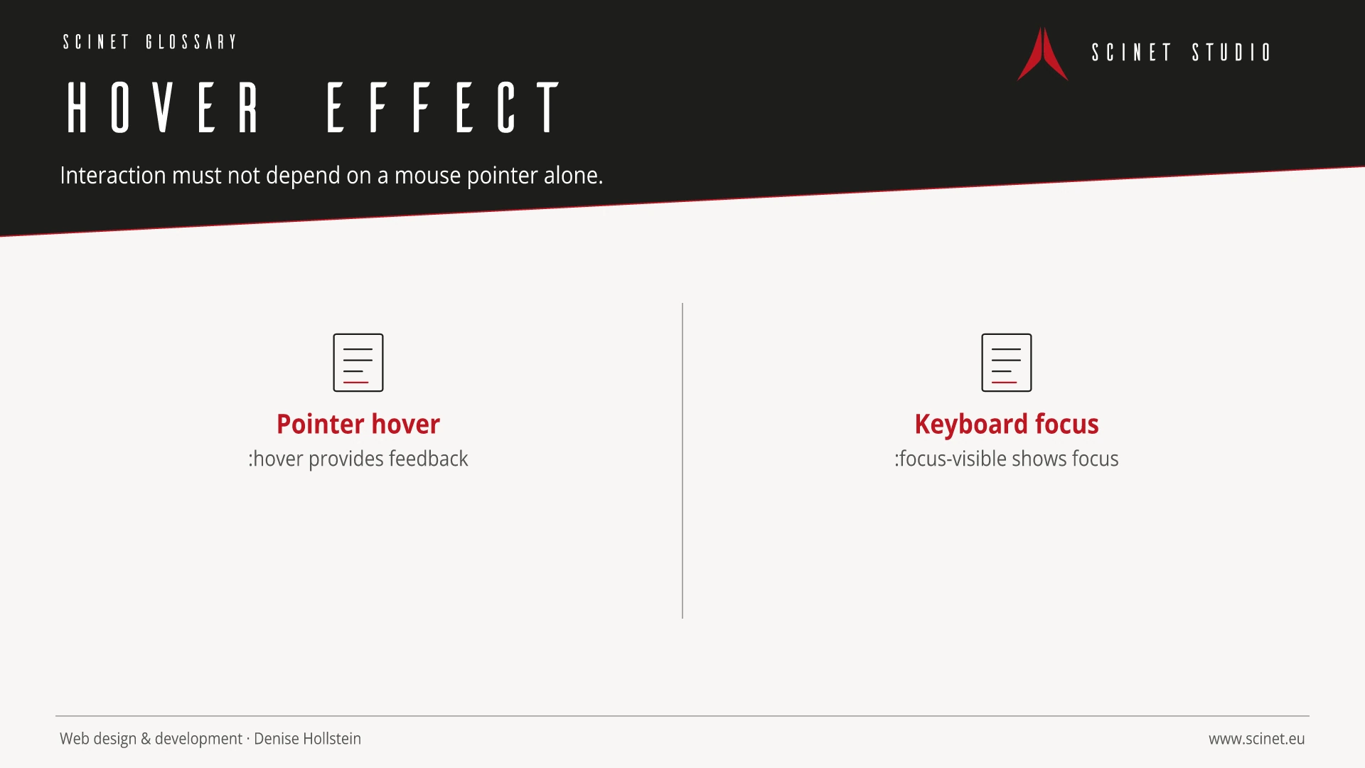
A hover effect changes an element's presentation while a pointing device rests over it without activation. CSS commonly implements this through the :hover pseudo-class. Such effects can signal that an element is interactive or provide additional visual feedback, but they should never be the only route to important information or functionality.
Touch devices have no reliable persistent hover state, while keyboard users reach elements through focus. A robust interface therefore provides equivalent :focus-visible and active states and keeps essential content available without hover. Motion, contrast, and size changes should be restrained so they improve orientation without layout shifts or unnecessary distraction.
At a glance
Hover Effect in practice
Hover is an additional cue, not a reliable primary interaction. Touch devices and keyboard users need the same information through visible labels, focus states, or an explicit click.
An interface element should have a recognisable purpose and behave consistently across the site. Focus, hover, error, loading, and small-screen states are part of the component. Implementation becomes more reliable when content, semantic element, and visual presentation are considered separately. Interaction then remains understandable without animation and when assistive technology is used.
Hover Effect: relevance to SEO, paid search, and GEO
Recognisable components reduce orientation time and make important actions easier to find. This helps visitors from both organic results and ads. Elements should not compete for attention: a clear visual hierarchy, descriptive labels, and restrained effects support the path to conversion better than constant movement or several equally prominent calls to action.
For search and answer systems, coverage of Hover Effect should distinguish its definition, scope, and evaluation criteria. The editorial reference is “Selectors Level 4: The :hover pseudo-class” by W3C, making central claims traceable for readers and machine-based systems.
Practical code example
Style hover and keyboard focus together
Visible feedback works with both mouse and keyboard. focus-visible avoids an unnecessary focus ring for typical pointer clicks.
.card-link {
  color: #050505;
  transition: color .2s ease, transform .2s ease;
}

.card-link:hover,
.card-link:focus-visible {
  color: #be1622;
  transform: translateY(-2px);
}

.card-link:focus-visible {
  outline: 3px solid #be1622;
  outline-offset: 4px;
}
Sources and further reading
- Standard Selectors Level 4: The :hover pseudo-class W3C · Checked
